 Skip to content



Fifty tours and a tourism campus, rebuilt into one site.
Toerbroers runs close to a hundred departures a year and trains the next generation of tour guides. The old website had all of it somewhere — but a traveller had to dig for a date or a price, and the campus was buried among the tours.
Who is Toerbroers?
An Afrikaans tour operator founded by Andries Hendrik Potgieter and Wiaan Fourie, running close to a hundred local and international tours a year — from Kruger weekends and flower tours to Zanzibar, Norway and New York. Alongside the tours sits the Toerbroers Kampus, a practical tourism school with courses in culture, nature, animal care, game farm management and a Zanzibar programme. Two businesses, one brand, and one website that had to carry both.
What was wrong with the old site?
The content was all there. The problem was finding it. A traveller who wanted to know when the next tour left, and what it cost, had a long way to scroll — and the campus, a separate business with separate customers, was treated as just another tour.
One very long homepage
Tours, the campus, the magazine, certificates, awards and sixteen YouTube videos, stacked one after another with nothing leading.
A heavy video hero
The first screen was a looping background video with animated lettering — slow to load on a phone, and it said very little about what was on offer.
Tours without a common shape
Every tour page was laid out differently, so comparing dates, inclusions and prices across two trips meant reading both from top to bottom.
Local and international mixed up
The tour categories had drifted — a Serengeti safari filed as a local tour, others not filed at all — and the campus courses sat in the same list.
The year lived in a PDF
The full departure schedule was a printed brochure. Useful to download, but no help to someone scanning for a free weekend in March.
A brand lost in translation
English visitors using the translate button saw the name turned into “Tour Brothers” — in the page title, the headings and the logo text.
What actually changed?
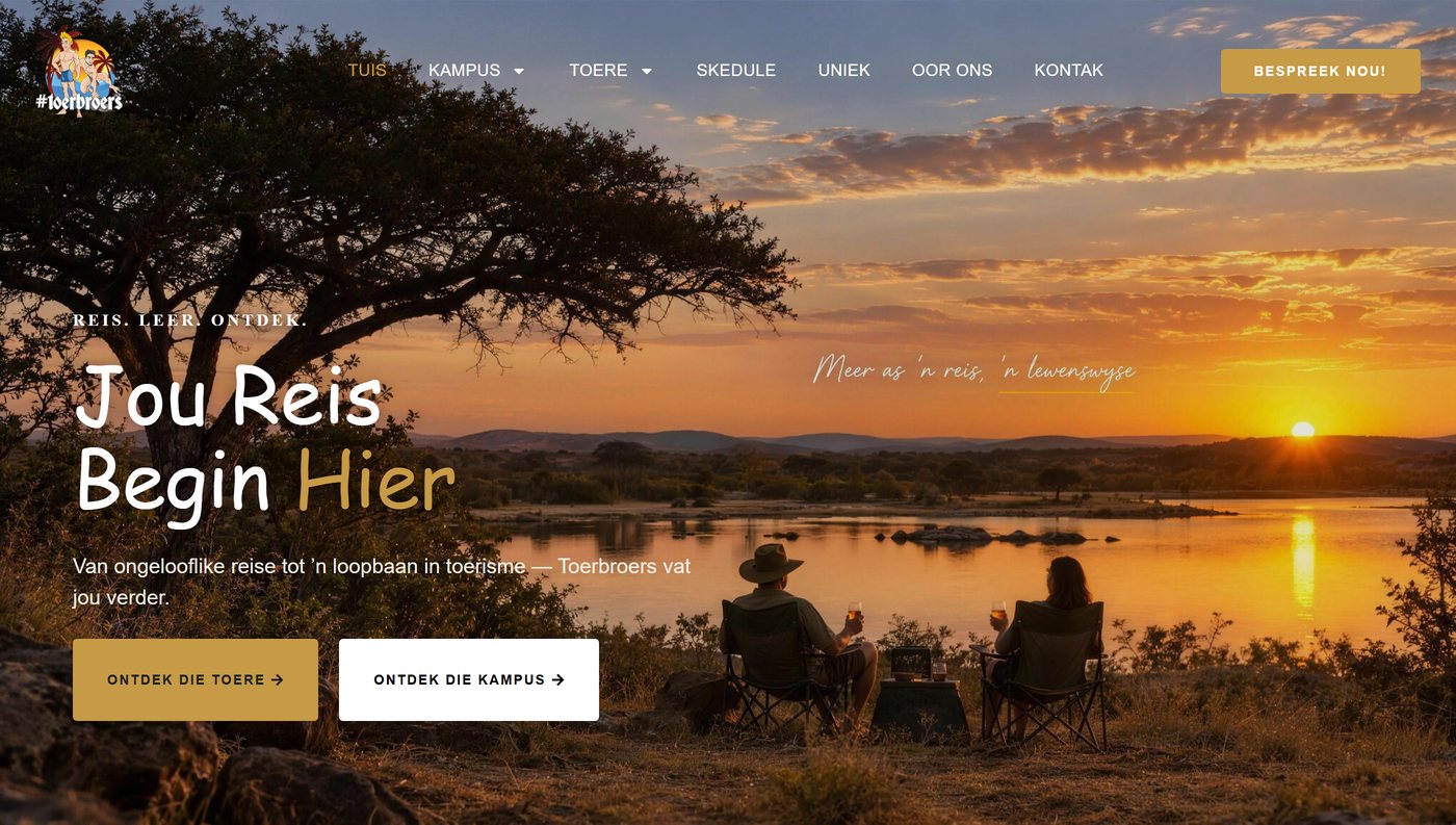
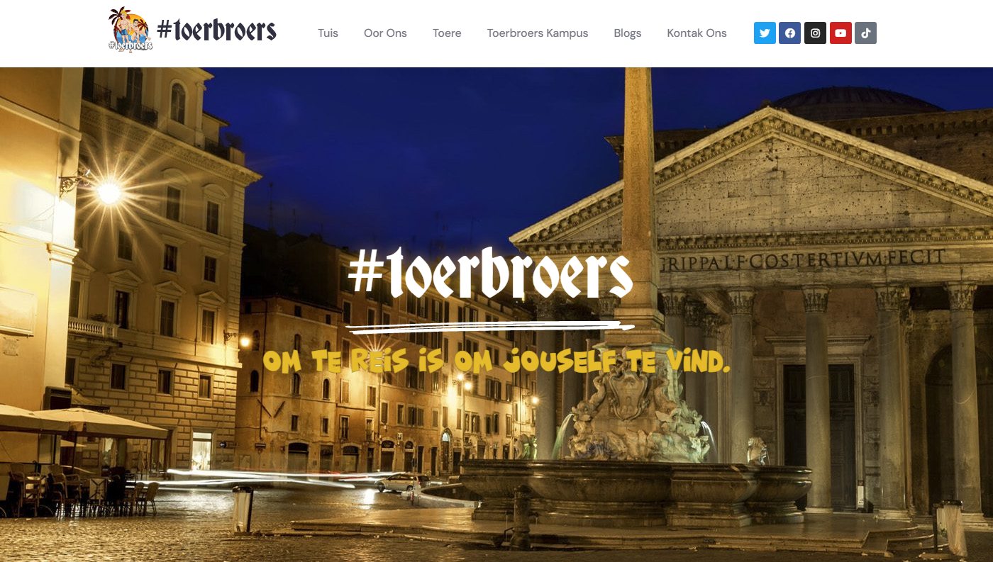
What did the rebuild change?
The first screen now asks one question — are you here for a tour, or for the campus? — and everything behind it was rebuilt so the answer takes a click, not a scroll. The tour descriptions, dates and prices came from Toerbroers’ own flyers and brochures; our job was the structure they sit in.
One layout for every tour
Duration, departure dates, what is included and what is not, the deposit and the prices — always in the same place, followed by a photo gallery.
Every tour moved across
Over fifty tours migrated from the old site with their photos, then filed as local or international by where they actually go.
Photos sharpened
Thirty tour heroes and every page banner were upscaled from heavily compressed originals, so a full-width photo no longer looks smeared.
The year on one page
A skedule of 87 departures, grouped by month in the brochure’s own order, with the full PDF still a click away.
A home for the campus
Kampus and its syllabus pages: five courses, each with its duration, a summary and its own downloadable brochure.
The magazine, readable
The Toerbroers Atlas opens as a page-turning flipbook on the site itself — 44 pages, loaded as you read, with the PDF to keep.
And underneath: the name is protected from the translate button, so English visitors read Toerbroers everywhere; the whole site had an Afrikaans spelling pass; and the old tour and page addresses redirect to their new homes, so links in years of Facebook posts still land somewhere useful.
What does success look like here?
The site is newly live, so there is no before-and-after traffic figure yet, and we would rather leave the space empty than fill it with a guess. What can be measured today is what a visitor can do: find any tour’s dates and price in two clicks, see the whole year on one page, and reach the campus without wading through the tours to get there. When the numbers have had a season to settle, they will go on this page.
See it for yourself: toerbroers.co.za. The other case studies are on the case studies page, and the full list of what we have built is on our work.
What would the “before” say about your site?
Send us your web address and we'll go through the site and the SEO underneath it, then send back a written audit within 48 hours — the same look we take before starting any project like this one.