 Skip to content
Responsive website design has become crucial in today’s digital world. With people using various devices to browse the internet, websites need to adapt to different screen sizes. Responsive web design uses HTML and CSS to automatically resize, hide, shrink, or enlarge a website to make it look good on all devices.
This approach ensures that your website provides a smooth user experience across desktops, tablets, and smartphones. It eliminates the need for separate mobile versions of websites, making maintenance easier and improving search engine optimization.
Responsive design isn’t just about adjusting layouts. It also involves optimizing images, text, and other media for different screen sizes. By using flexible grids, responsive images, and CSS media queries, designers can create websites that look great and function well on any device.
Key Takeaways
- Responsive design adapts websites to different screen sizes for optimal viewing
- It uses flexible layouts, images, and CSS media queries to adjust content
- Responsive design improves user experience and simplifies website maintenance
Foundations of Responsive Design
Responsive design relies on core principles that allow websites to adapt to different screen sizes. These foundations ensure a seamless user experience across devices.
Defining Key Concepts
Responsive web design is an approach that makes web pages look good on all devices. It uses flexible layouts and images that adjust to fit various screen sizes.
The main goal is to create a single website that works well on desktops, tablets, and phones. This saves time and money compared to making separate sites for each device type.
Key concepts include fluid grids, flexible images, and media queries. Fluid grids use relative units like percentages instead of fixed pixels. This lets page elements resize based on screen width.
Flexible images also resize to fit their containers. They don’t overflow or leave empty space on smaller screens.
The Role of HTML and CSS
HTML and CSS are essential for creating responsive websites. HTML provides the structure and content of a web page. CSS handles the layout and styling.
Responsive CSS techniques include using relative units and media queries. Media queries let designers apply different styles based on screen size or device type.
CSS Flexbox and Grid are powerful tools for responsive layouts. They make it easier to create flexible, multi-column designs that adapt to different screen sizes.
Viewport meta tags in HTML tell browsers how to scale the page on mobile devices. This ensures the page displays correctly at the device’s full width.
Building Blocks of RWD
Responsive web design relies on three key elements to create websites that adapt to different screen sizes. These components work together to ensure content displays properly across devices.
Flexible Grids and Layouts
Fluid grids form the foundation of responsive design. They use relative units like percentages instead of fixed pixels.
This allows content to resize smoothly as the viewport changes. A flexible grid system typically divides the page into columns.
Elements can span multiple columns and reflow as needed. CSS Flexbox and Grid provide powerful tools for creating fluid layouts.
Designers often use a 12-column grid as a starting point. This offers many options for arranging content while maintaining consistency.
Media Queries and Breakpoints
Media queries let designers apply different CSS styles based on device characteristics. The most common use is adjusting layouts at certain screen widths.
Breakpoints are the screen sizes where layout changes occur. Common breakpoints include 320px, 768px, and 1024px.
At each breakpoint, the design may shift columns, resize elements, or rearrange content. Media queries use max-width and min-width to target specific ranges.
For example:
@media (max-width: 600px) {
  .column {
    width: 100%;
  }
}
This code makes columns full-width on small screens.
Flexible Images and Media
Images and other media must also adapt to different screen sizes. The max-width property ensures images don’t exceed their container:
img {
  max-width: 100%;
  height: auto;
}
This allows images to scale down on smaller screens while maintaining their aspect ratio.
For icons and logos, SVG files work well. They scale smoothly to any size without losing quality.
Responsive images can load different sizes based on the device. The picture element lets browsers choose the best image source.
User Interface and Experience
Responsive website design focuses on creating adaptable interfaces that work well across devices. Key aspects include typography, interactions, and accessibility to ensure a smooth user experience.
Adaptive Typography and Text Size
Responsive web design includes flexible typography that adjusts to different screen sizes. Text size changes based on the viewport width, maintaining readability on all devices.
Designers use relative units like em or rem instead of fixed pixel sizes. This allows text to scale proportionally with the screen size.
Line length is also crucial for readability. On wider screens, content width is limited to prevent excessively long lines. On mobile devices, text reflows to fit the narrower width.
Responsive Design for Interactions
Interactive elements like buttons, forms, and menus need special attention in responsive design. Touch targets should be large enough for easy tapping on mobile devices.
Navigation menus often transform into hamburger menus on smaller screens. This saves space while keeping all options accessible.
Responsive UI/UX strategies ensure that interactive features work well across devices. This might include using hover effects on desktop and touch events on mobile.
Accessibility in RWD
Responsive design must consider accessibility to create inclusive experiences. This involves:
- Maintaining sufficient color contrast across all screen sizes
- Ensuring text remains readable when zoomed
- Providing alternative text for images
Designers use media queries to adjust layouts based on device capabilities. This helps create tailored experiences for users with different needs.
Keyboard navigation is important for accessibility. Responsive designs ensure that all interactive elements are reachable and usable via keyboard input on any device.
Frameworks and Tools
Responsive web design relies on various frameworks and tools to create adaptable layouts. These resources help developers build sites that work well across devices.
Using CSS Frameworks
CSS frameworks provide pre-built components for responsive layouts. Bootstrap is a popular choice, offering a grid system and ready-made elements. It allows quick development of mobile-friendly designs.
Foundation is another robust option. It provides flexible grids and UI components.
W3.CSS is a lightweight alternative. It focuses on simplicity and speed.
These frameworks include:
- Responsive grids
- Pre-styled components
- Built-in media queries
Developers can customize these frameworks to match their project needs. This saves time and ensures consistency across different screen sizes.
Responsive Design with JavaScript and jQuery
JavaScript and jQuery enhance responsive designs with dynamic behavior. They allow elements to adapt based on screen size or user interactions.
jQuery simplifies DOM manipulation and event handling. It’s useful for:
- Showing/hiding content
- Adjusting layouts on resize
- Creating mobile-friendly menus
Pure JavaScript can also create responsive features. It offers more control but may require more code.
The viewport meta tag is crucial. It instructs browsers how to scale the page on different devices.
<meta name="viewport" content="width=device-width, initial-scale=1">
This code ensures proper rendering on mobile devices.
Testing and Debugging Tools
Responsive design tools help test and debug layouts across devices. Browser developer tools offer device emulation modes. These simulate various screen sizes and resolutions.
Online services like Responsinator show sites on multiple device screens at once. This helps spot layout issues quickly.
BrowserStack allows testing on real devices remotely. It’s valuable for checking performance and compatibility.
Chrome DevTools includes a responsive design mode. It lets developers adjust viewport size and test different breakpoints.
Key testing areas include:
- Navigation usability
- Image scaling
- Text readability
- Touch target sizes
Regular testing on various devices ensures a smooth user experience across platforms.
Frequently Asked Questions
Responsive website design involves key technical skills, best practices, testing methods, and layout considerations. It aims to create an optimal viewing experience across devices through flexible grids and adaptable content.
How do I create a responsive website from scratch using HTML and CSS?
To create a responsive website, start with a flexible grid layout using CSS. Use relative units like percentages instead of fixed pixel widths.
Implement media queries to adjust styles based on screen size. Set appropriate breakpoints for different devices.
Use flexible images that scale with their container. The max-width: 100% CSS property ensures images don’t exceed their parent element’s width.
What are the best practices for implementing responsive design in web development?
Design with a mobile-first approach. Start with styles for small screens, then add complexity for larger ones.
Use a flexible grid system to create layouts that adapt to different screen sizes. This allows content to reflow smoothly.
Optimize images and media for different devices. Serve smaller file sizes to mobile users to improve load times.
Keep navigation simple and touch-friendly for mobile users. Consider using a hamburger menu for smaller screens.
How can I test my website to ensure it is responsive on all devices?
Use browser developer tools to simulate different screen sizes and devices. Most modern browsers offer this functionality.
Test on real devices when possible, including various smartphones, tablets, and desktop computers.
Use online tools like LambdaTest to check responsiveness across multiple devices and browsers simultaneously.
What are the essential components of a flexible grid system in responsive web design?
A flexible grid system uses relative units like percentages or em units instead of fixed pixel widths.
It typically consists of columns and gutters that adjust based on screen size. The number of columns may change for different devices.
Breakpoints are set to determine when the layout should change. These are usually based on common device screen widths.
How does responsive design improve the user experience across different devices?
Responsive design ensures content is readable and accessible on any device without zooming or horizontal scrolling.
It adapts layouts to different screen sizes, providing an optimal viewing experience for each device.
Page load times can be improved by serving appropriately sized images and resources based on the device.
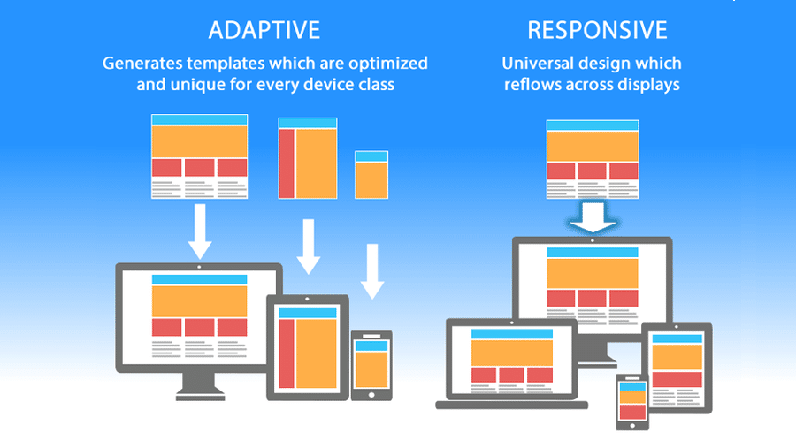
What are the differences between adaptive design and responsive design in web development?
Responsive design uses fluid grids and flexible images to adapt to any screen size. It provides a seamless experience across all devices.
Adaptive design creates separate layouts for specific screen sizes. It detects the device type and loads the appropriate layout.
Responsive design is generally more flexible and future-proof, while adaptive design can offer more control over specific device layouts.