 Skip to content



One store trying to be five, rebuilt as one.
Checkalot sells smart everyday finds across home, kids, outdoor, pet and wellness. The products were never the problem — the template was pulling in five directions at once and burying the brand promise.
Who is Checkalot?
An online retailer of everyday finds spanning home accessories, kids' products, outdoor gear, pet supplies and wellness. The brand promise is “Shop Different” — a genuinely good positioning line for a store selling across that many categories, which the old site did nothing with.
What was going wrong?
A catalogue this broad needs structure more than it needs styling. Instead it had a template that pulled in every direction at once, and a promise that lived in the logo and nowhere else.
One store, five identities
Glitter cups, bath mats and backpacks competed for the same attention with no shared category logic holding them together.
A promise in name only
“Shop Different” appeared in the logo and nowhere in the actual experience of shopping.
A path that fought the shopper
Cluttered navigation and stacked, repetitive sections slowed down every route to the checkout.
Trust bolted on, not built in
Delivery, returns and payment cues felt tacked on at the end rather than placed where the doubt actually occurs.
What actually changed?
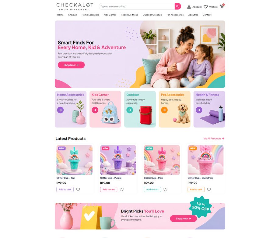
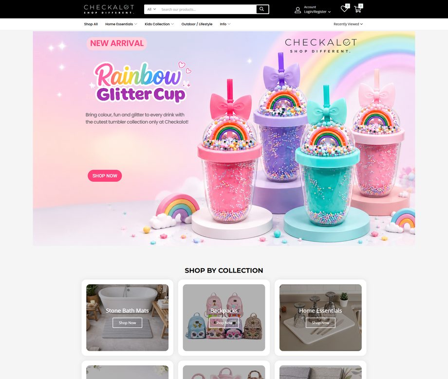
How did we rebuild it?
We did not reskin the old store. We rebuilt the logic underneath it first, so every visitor lands in the right aisle fast, and only then wrapped it in one confident brand system.
Category-first architecture
Five clear lanes replace the clutter, so a shopper finds their aisle in one glance instead of scrolling to find it.
One brand system, end to end
Five competing identities collapsed into one, so the store stops feeling like five shops sharing a checkout.
A hero that does a job
Not a decorative banner. It answers what the shop sells and where to go next, in the space people actually look first.
Reassurance by design
Delivery, returns and payment answered at the moment of doubt, rather than in a policy page nobody opens.
What changed?
Same catalogue, sharper structure, and a path to checkout you can follow in about five seconds. This one is judged on structure rather than a revenue percentage — a store rebuild shows up in how easily people find things long before it shows up in a quarterly figure.
See it for yourself: checkalot.co.za. The other case studies are on the case studies page, and the full list of what we have built is on our work.
What would the “before” say about your site?
Send us your web address and we'll go through the site and the SEO underneath it, then send back a written audit within 48 hours — the same look we take before starting any project like this one.